Wednesday, September 22, 2010
pretty picture
Monday, September 20, 2010
hey fatty bum bum want another donut?!

Thursday, September 16, 2010
"We think you're really boring..."
AAAAAAAAAAAAAAAAAAAHHHHHHHHHHHHHHHHHHHHHHHHHHHHHHH
My first day back at uni and already my head is chocker! my first brief is to prove i'm not boring?!
my head hurts.
Tuesday, August 17, 2010
Grey day
Friday, June 25, 2010
Long time no blog!


Monday, April 26, 2010
Hunrgy anyone?
Sunday, April 25, 2010
buongiorno
Due to the volcano cloud our flights got cancelled so i've missed the past week of uni :/ (and then ofcourse it was the easter holidays before so i apoligise for not blogging for a while).
It was truly a nightmare trying to find a route home, in the end we got the train from Florence (which is absolutely beautiful in a shabby chic way) to Nice (which took 7 hours) then we stayed two nights in Nice (which is also beautiful but in a more perfected way) and then had THE longest car journey of my life! My dads good friend picked us up from Nice then it was 15 hours from there to Calais then 6 hours from Calais to home.
After this trip i never want to eat pizza or pasta or get in a car for more than 2 hours EVER AGAIN!

The view from Piazza della Michaelangelo :)
Monday, March 29, 2010
and the stress is over!
Wednesday, March 24, 2010
Le Tour Eiffel
Tuesday, March 23, 2010
Paris!
Productiveness!
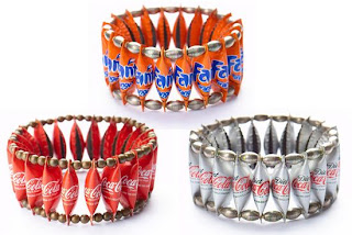
Today in our workshop we finally got some jewellery made! These are just some of the items we hope to sell next week. While me and Rochelle made the jewellery, Stephen created a facebook event to invite people to come to our stall. As soon as we know the times and confirm the location we can add these to the posters we have designed and stick them around campus, maybe even hand out some flyers to people to encourage them to buy our jewellery and cakes. So far we have spent £20 most of our jewellery will be sold for a £1 or slightly more depending on what item it is so hopefully if we sell all of our products we ca n make a profit!
Sunday, March 21, 2010
thought i typed in custard powder
Thursday, March 18, 2010
Alexa Meade
Tuesday, March 16, 2010
J'adore
Pecha Kucha is a fast and furious Japanese import that has taken London by storm since its introduction in the summer of 2005. It was concieved by Klein Dytham, an architect in Tokyo.
The format is simple- each speaker must present 20 images which are projected on screen for only 20 seconds each (we are only being asked to do 10 images-phew!). This style of presentation encourages the speaker to edit their ideas, inspirations, frustations and aspirations into a rapid-fire time slot forcing you to articulate your message clearly. sounds scary!
I've decided to my presentation on Paris! I first fell in love with the city when i was just 6 years old. I remember standing at the top of the Eiffel Tower looking across the city and it literally took my breath away. I always imagine i'll end up as a stylish old lady living in a townhouse on the left bank eating baguettes and reading poetry or something. The fashion, the food, the language (i got an A at gsce yay), the art, the ambience! I love it all! It's such a beautiful and inspiring city i think it would be perfect to do my presentation on! Only problem is how to put my love across in 20 seconds per picture haha!
Au Revoir! xxx
What a lovely package! (ahem)
Today's Lesson- or lack of
Tuesday, March 9, 2010
Thirsty anyone?
All things nautical

These are the pretty little buttons and ribbons i purchased. I particulary like the skull and cross bone buttons as i think they add a harder edge to our otherwise "cute" pieces.
Rochelle has managed to find these amazing bargains on Ebay:

She is bidding for four wheels, fifteen anchor pendants and 10 brooch locking pins all adding to around £8 which brings our total spends up to £21 so far (if she manages to win the bid obviously).
Workshop


Hello Sailor! Logo!


Thursday, March 4, 2010
Obsession
Aye Aye
Sunday, February 28, 2010
Zine rework
lack of inspiration/motivation!
kidding :D i will work promise
amazing
Monday, February 22, 2010
Gimmick or groundbreaking chance for change?

There’s always a fair amount of debate over the size and shapes of the models at any fashion week, but in stark contrast to the super-skinny girls Victoria Beckham chose to model her latest dress collection, designer Mark Fast picked size 12 and 14 girls to model in his weekend LFW show. Is this a groundbreaking chance for change or just a gimmick for a fairly unheard of designer to gain more publicity? (taken from heatworld.com)
Although i agree that they should use models who are a normal size on the catwalk, why put these girls in clothes that are ill-fitting? The hair and make-up does nothing for them either. It feels like a half-hearted attempt, almost a ploy to make using normal sized girls look bad so everyone continues using starving size zeros! I find it sad that sizes 12-14 are considered plus sizes these days, i mean what kind of message is this sending out!
Sunday, February 21, 2010
Rarr raarr aah ah aahhh
Sunday, February 14, 2010
Daisy Garland
Epilepsy affects 300,000 people in the UK. At the moment there is no cure, although around 70% of people with epilepsy have medication to completely control their seizures.
I chose this charity as i found it completely heartbreaking, and aswell i know someone who was affected by epilepsy and tragically she also died just a month before her 16th birthday.
I think its amazing the strength of Daisy's parents to want to help other children who suffer from epilepsy, i also find their website very helpful on learning more about the condition.
xxx
Friday, February 12, 2010
Pepsi

One of the world's biggest soft drinks company Pepsi, was started in the 1890's (wow!) by Caleb Bradham. Initally named as Brad's drink the company quickly changed it's name to Pepsi Cola and used the first logo which was designed in 1898. In 1903 the name was trademarked and hasn't been changed to this date! Brad made custom logos until 1933 when the company was bought by Loft, Inc. The company changed the bottle size from 6 to 12 oz. and came up with the ‘Refreshing and Healthful’ logo.
However, the major breakthrough in the Pepsi logo design came in 1940’s. Walter Mack, the CEO of Pepsi came up with the idea of a new bottle design, with a crown having the Pepsi logo. The ‘Pepsi Globe’ emerged when USA was in WWII, and to support the country’s war efforts, Pepsi had a blue, red and white logo.
In 1950 and 1962, this bottle cap with the swirling blue and red became prominent in the company logo. During the 1960’s when it became even more popular, the script was changed from the curly red, and the main attraction was on the bottle cap in the logo.
We see the first appearance of the Pepsi Globe instead of the bottle cap in 1973. The typeface was made smaller so as to fit in the globe. The Pepsi Globe was “boxed in”, with a red bar coming in from the left and a light-blue bar coming in from the right.
In 1991, the typeface was moved from inside the globe. The red bar was lengthened and the typeface came on the top of the globe. In 1998, the white background in the logo was replaced by the blue color, which also resulted in dropping the red horizontal band. The globe now had 3D graphic and larger than earlier versions. It might be that since, Pepsi and the globe touch each other for the first time in the logo, the name ‘the Pepsi Globe’ was given to the logo.
After 1998, it seems that Pepsi had decided to give the globe more prominence than the script itself. So, the globe came on top of the script in 2003, and in their current logo they have done away with the script altogether.
Nikeeeeees
which made it more simple and memo
 rable.
Evolution
When Apple first started their logo was a complicated design of Isaac Newton sat under a tree, which had been designed by Steve Jobs and Ronald Wayne (2 of the 3 founders of Apple) with the inscription: “Newton … A Mind Forever Voyaging Through Strange Seas of Thought … Alone.” Frankly, I don’t think it was just a coincidence that Apple had slow sales during this period. Steve Jobs then hired Rob Janoff to simplify the logo. Rob created the rainbow apple which was the logo for the company until 1998.
There are many rumors as to why Rob had chosen to create such a logo. One of them says that the Apple was a tribute to Newton (discovery of gravity from an Apple), and since the USP (Unique Selling Point) for Apple at that time was colored graphics, it had the rainbow colors. Another explanation exists that the bitten apple pays homage to the Mathematician Alan Turing, who committed suicide by eating an apple he had laced with cyanide! Turing is regarded as the father of computers. The rainbow colors of the logo are rumored to be a reference to the rainbow flag, as homage to Turing’s homosexuality.
Now it is more the shape that identifies the company more than the colour, as it is one of the most recognised symbols in the world! Wow interesting history!


